The Brief.
We also discuss some key highlights, challenges and behind the scenes stories, giving our visitors a sense of involvement, and showing them that sometimes things do not go as planned, and that's okay.
Most brief summaries will be concluded with short, two or three sentence-long paragraph, which will act as a closing statement (kinda).
Bevlan Office Interiors' brand evolution was strategically driven by the need to engage a younger demographic of decision-makers. This demographic prioritises a strong digital presence when selecting office design partners, necessitating a contemporary brand identity for Bevlan.
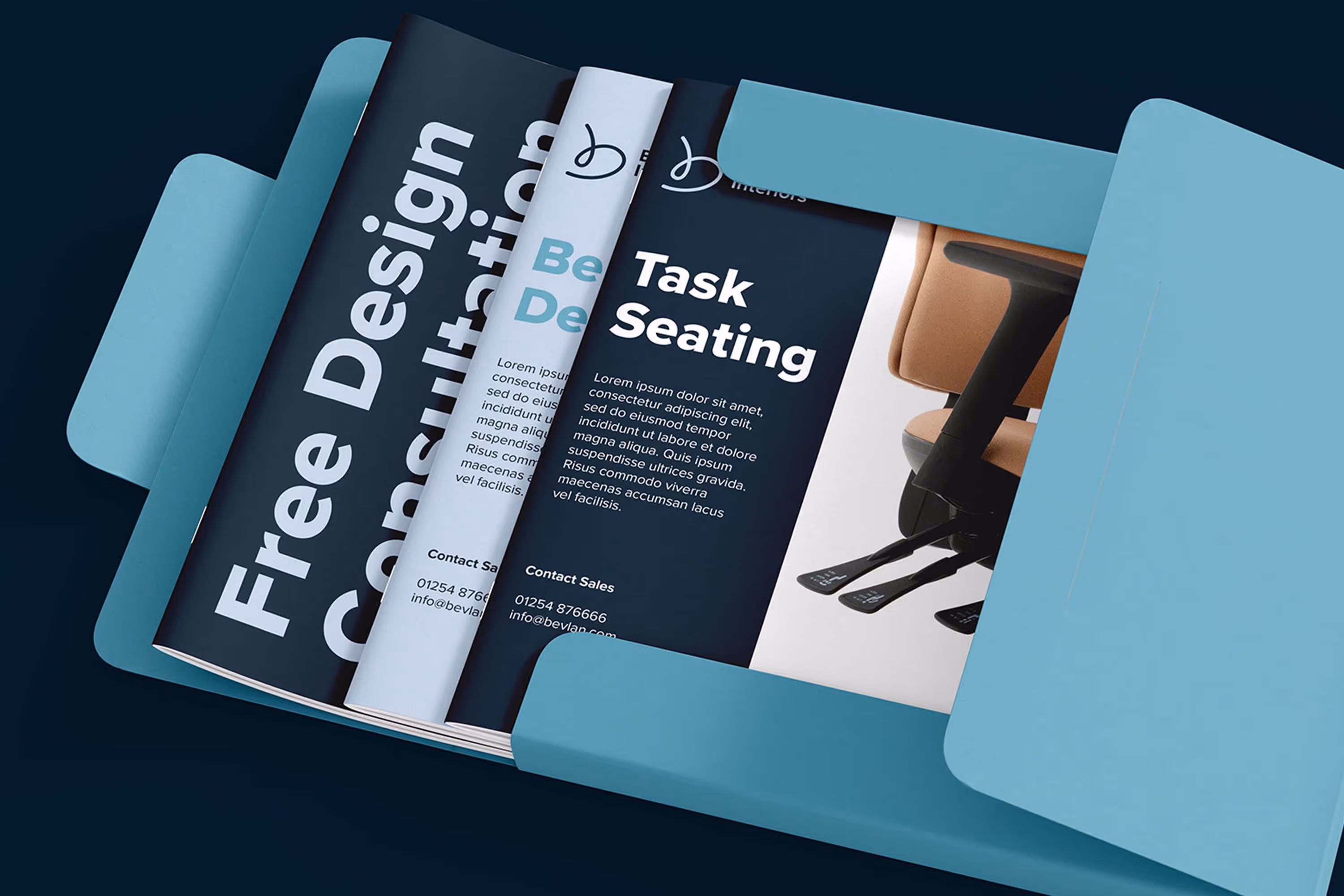
The project began with a complete brand overhaul, developing a new visual language from scratch to effectively communicate Bevlan's core mission and values. Recognising their established 35-year legacy, we retained their signature teal in a new, subtly refined form — Bevlan Teal II — to integrate within a contemporary palette of Midnight and Sail – a balance of heritage and modern appeal.
Logo design was a key focus. The objective was a unique and instantly recognisable logomark to maximise brand memorability in the digital landscape. Following extensive concept exploration, we focused on the concept of an artist's signature upon a finished piece. This metaphor best encapsulates Bevlan's approach: each design project is executed with meticulous care and dedication, confidently bearing the brand's endorsement. This informed the distinctive 'b' lettermark, incorporating a plush 'cushion' to subtly allude to furniture comfort.
Concurrent with the identity refresh, a new website addressed critical limitations of the previous iteration. The redesigned site offers enhanced features and functionality, a streamlined user experience, and a bespoke CMS system which made content administration a breeze, and significantly reduced operational costs.